

There
has been recent controversy with conflict between
Paul
Beckwith and Guy McPherson that centres around the
contention
that there could be near-term human extinction,
not
only within one lifetime but within ten years.
Throughout
this Beckwith’s criticisms have been unfairly directed at Guy
McPherson where his statements (as usual) are based on the current
evidence as well as the work of others. Most notably Sam Carana at
Arctic Blog has raised the possibility of extinction but he has been
largely immune from criticism, somethig I see as deeply unfair.
When
I raised it several weeks Beckwith replied that he was
critical
of Sam’s polynomial trendlines.
I
decided to raise this directly with Sam Carana and this was his
response.
On exponential growth and
polynomial trendlines
Yes, Paul Beckwith (and others) have long expressed problems with (some)
polynomial trendlines. This has been discussed many times, e.g. as reflected at the Controversy Page at http://arctic-news.blogspot.com/p/controversy.html
The graph that shows a potential warming of 10°C by 2021 takes things one step further, as it is based on Jan 2012-Feb 2017 data, to better reflect the impact of feedbacks that are starting to kick in and the interactions between them, as discussed at the post 'Which Trend Is Best?', at http://arctic-news.blogspot.com/2017/03/which-trend-is-best.html

Paul Beckwith has also expressed criticism regarding the estimate for the warming impact of less aerosols, in particular sulfur. While the speed and magnitude of the temperature rise may be overestimated in some warming elements (such as aerosols), the impact from methane and from further feedbacks may well be underestimated, as Guy says and as also said at the extinction page.
Note also the recent post at Arctic-news, which looks at the impact of oceans taking up less CO2 and heat from the atmosphere, which could dramatically increase the magnitude and speed of 'further feedbacks'.
In conclusion, a 10°C could well eventuate as early as 2021.
---Sam Carana (via Facebook)
Here is the article he refers to -
Non-linear trendlines (polynomial and
exponential growth)
exponential growth)
Paul
Beckwith has expressed concerns that the use of polynomial
trendlines, given their focus on recent data, are not appropriate in
climate change projections. Paul therefore believes that, as a
climate scientist, he needs to take distance from graphs using
polynomial trendlines.
While acknowledging Paul's point, Sam Carana does use polynomial trendlines in graphs, arguing that polynomial trendlines do show scenarios that could eventuate in the near term and therefore constitute important warnings to reduce the risk of abrupt climate change.
Sam Carana as editor argues that the Arctic-news blog should alert readers when dangerous situations threaten to develop in the Arctic. Important in this regard is how the precautionary principle is interpreted. Risk is a combination of both the probability that something will eventuate and the severity of the consequences. The consequences of large amounts of methane escaping from the Arctic Ocean seafloor could be so severe that even a small chance that this will eventuate constitutes a huge risk and therefore deserves serious attention. Accordingly, argues Sam Carana, the precautionary principle therefore should lead to comprehensive and effective action to reduce the risk.
One characteristic of polynomial trendlines is that they can amplify relatively small recent rises or falls, making the trendline go through the roof when extended far into the future. This can be avoided by limiting the plot area of the graph.

|

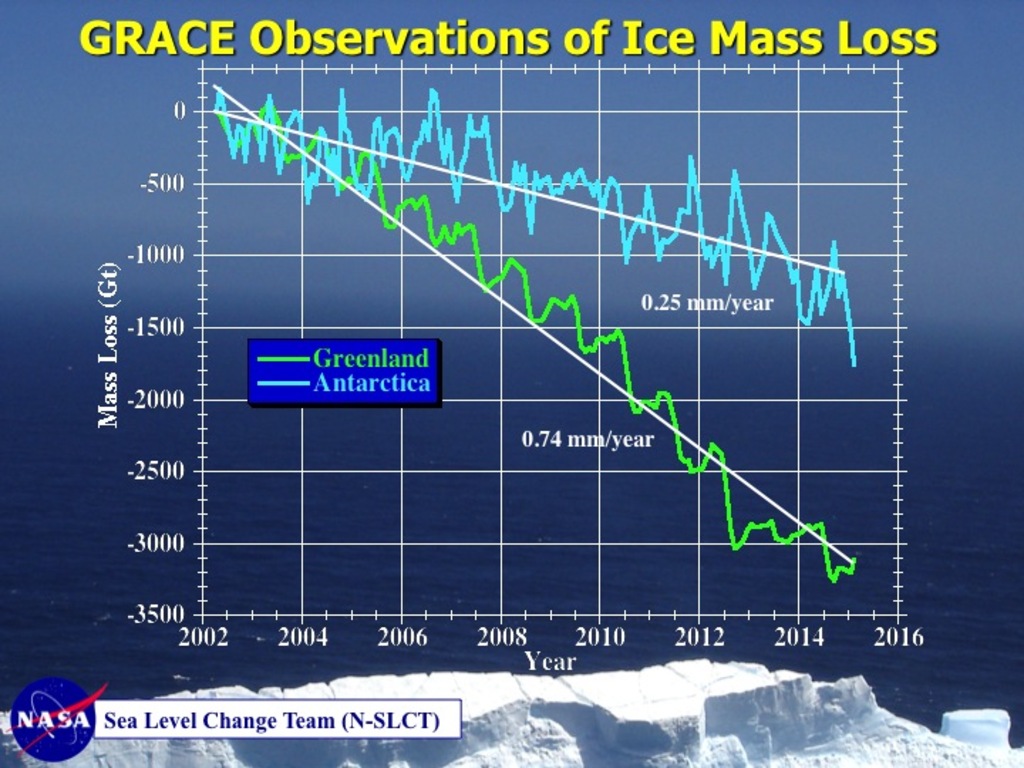
Polynomial
trendlines are not the only way to warn about accelerating
developments. The image on the right shows ice mass loss on Greenland
and Antarctica. The Grace satellites were launched in March 2002, so
we only have these data from 2002 to 2015. The baseline can be put
anywhere between 2002 and 2015, without changing the shape of graphs.
Putting the baseline at 2002, as in the top image right, could create
the false impression that no melting had occurred prior to 2002.
Putting the baseline halfway in between 2002 and 2015, as in the
image on the right below, therefore makes more sense.
The baseline is thus put halfway in between the years for which data are available, which shows that the ice mass has fallen more steeply on Greenland than on Antarctica. It also makes it easier to spot acceleration of ice loss. Acceleration of ice loss on Antarctica is relatively minor, starting at about +1000 Gt and ending at about -1000 Gt It was actually somewhat below -1000 Gt for a while in 2014. Anyway, ice loss on Greenland was not only more, the loss is also speeding up, starting at +1500 Gt and ending at far below -1500 Gt, i.e. at about -2000 Gt. This way, the graph shows more clearly that Greenland's ice loss is speeding up in a non-linear way, without resorting to polynomial trendlines to show this.
Nonetheless, a polynomial trendline is much stronger in making this point, when extending the trend into the future, as illustrated by the graph below.

|
| Dramatic ice mass loss on Greenland looks set to get even worse. |
Below
is another example of the use of polynomial versus linear trendlines,
from the post Arctic
sea ice remains at a record low for time of year.

|
| INSET: while a polynomial trendline captures the rise from 2000 and extends it into the future, a linear trendline doesn't project temperature anomalies to rise above 1°C before 2020, even though the January 2016 value was 1.82°C |
For
a further example of polynomial versus linear trendlines, see the
post 'More
than 2.5m Sea Level Rise by 2040?'
The comparison image below, from the FAQ page, illustrates that - in some cases - an exponential trendline can be more appropriate than a linear trendline. In this case, a linear trendline has 9 years fall outside its 95% confidence interval, versus only 4 years for an exponential trendline.
The comparison image below, from the FAQ page, illustrates that - in some cases - an exponential trendline can be more appropriate than a linear trendline. In this case, a linear trendline has 9 years fall outside its 95% confidence interval, versus only 4 years for an exponential trendline.

Furthermore, there are many feedbacks that can be expected to reinforce sea ice decline. Two such feedbacks are:
-
albedo change, i.e. less sea ice means that more sunlight will be absorbed by the Arctic Ocean, rather than being reflected back into space as before; and
-
storms that have more chance to grow stronger as the area with open water increases.
These
two feedbacks have been active from 1979 when satellites first
started to measure sea ice, which justifies the use of an exponential
trendline. As such feedbacks start to kick in more, though, warming
water threatens to cause destabilization of sediments that can
contain huge amounts of methane. Even relatively small increases of
methane releases over the Arctic Ocean can therefore justify the use
of polynomial trendlines.
Here is his article about extinction by 2026

That same time and day, a little bit to the south, at a spot in Sierra Leona, a level of carbon monoxide (CO) of 15.28 parts per million (ppm) was recorded, while the temperature there was 40.6°C or 105.1°F. Earlier that day (at 13:30 UTC), levels of carbon dioxide (CO₂) of 569 ppm and of sulfur dioxide (SO₂) of 149.97 µg/m³ were recorded at that same spot, shown on the bottom left corner of the image below (red marker).

These high emissions carry the signature of wildfires, illustrating the threat of what can occur as temperatures keep rising. Further emissions that come with wildfires are black carbon and methane.

Above image shows methane levels on April 22, 2017, AM, at an altitude corresponding to 218 mb. Methane at this altitude is as high as 2402 ppb (magenta indicates levels of 1950 ppb and higher) and while the image doesn't specify the location of this peak, it looks related to the magenta-colored area over West Africa and this looks related to the wildfires discussed above. This wasn't even the highest level recorded that day. While at lower altitudes even higher methane levels were recorded that morning (as high as 2505 ppb), above image illustrates the contribution wildfires can make to methane growth at higher altitudes.


As the image below shows, some hourly CO₂ averages for that day were well above 413 ppm.

These high CO₂ levels were likely caused by wildfires, particularly in Siberia.

As above image shows, methane levels as high as 2683 ppb were recorded on April 27, 2017. While the image doesn't specify where these high levels occurred, there are a lot of magenta-colored areas over Siberia, indicating levels over 1950 ppb. The image below shows carbon monoxide levels as high as 5.12 ppm near Lake Baikal on April 27, 2017.

As the image below shows, temperatures on April 28, 2017, were as high as 26.5°C or 79.6°F near Lake Baikal.

The satellite images below shows some of the wildfires. The images also show ice (in the left panel) over Lake Baikal on April 25, 2017, as well as over much of the Angara River that drains Lake Baikal. On April 28, 2017, much of that ice had melted (right panel).

Above image uses trendlines based on data dating back to 1880, which becomes less appropriate as feedbacks start to kick in that accelerate such temperature rises. Indeed, temperatures could rise even faster, due to feedbacks including the following ones:
• Less sunlight getting reflected back into space
As illustrated by the image below, more ocean heat results in less sea ice. This makes that less sunlight gets reflected back into space and instead gets absorbed by the oceans.
• More ocean heat escaping from the Arctic Ocean into the atmosphere
As discussed before, as less heat is mixed down to deeper layers of oceans, more heat accumulates at or just below the surface. Stronger storms, in combination with the presence of a cold freshwater lid on top of the North Atlantic, increase the possibility that more of this ocean heat gets pushed into the Arctic Ocean, resulting in sea ice loss, which in turn makes that more heat can escape from the Arctic Ocean to the atmosphere, while more clouds over the Arctic Ocean make that less heat can get radiated out into space. As the temperature difference between the Arctic Ocean and the Equator decreases, changes are occurring to the Northern Polar Jet Stream that further speed up warming of the Arctic.
• More heat remaining in atmosphere due to less ocean mixing
As also discussed before, warmer water tends to form a layer at the surface that does not mix well with the water below. This stratification reduces the capability of oceans to take up heat and CO₂ from the atmosphere. Less take-up by oceans of CO₂ will result in higher CO₂ levels in the atmosphere, further speeding up global warming. Additionally, 93.4% of global warming currently goes into oceans. The more heat will remain in the atmosphere, the faster the temperature of the atmosphere will rise. As temperatures rise, more wildfires will erupt, adding further emissions, while heat-induced melting of permafrost will also cause more greenhouse gases to enter the atmosphere.
• More seafloor methane entering the atmosphere

Here is his article about extinction by 2026
10°C or 18°F warmer by 2021?
Skyrocketing
emissions
On April 21, 2017, at 15:00 UTC, it was as hot as 46.6°C/115.8°F in Guinea, in West-Africa (at the location marked by the green spot on the map below).
On April 21, 2017, at 15:00 UTC, it was as hot as 46.6°C/115.8°F in Guinea, in West-Africa (at the location marked by the green spot on the map below).

That same time and day, a little bit to the south, at a spot in Sierra Leona, a level of carbon monoxide (CO) of 15.28 parts per million (ppm) was recorded, while the temperature there was 40.6°C or 105.1°F. Earlier that day (at 13:30 UTC), levels of carbon dioxide (CO₂) of 569 ppm and of sulfur dioxide (SO₂) of 149.97 µg/m³ were recorded at that same spot, shown on the bottom left corner of the image below (red marker).

These high emissions carry the signature of wildfires, illustrating the threat of what can occur as temperatures keep rising. Further emissions that come with wildfires are black carbon and methane.

Above image shows methane levels on April 22, 2017, AM, at an altitude corresponding to 218 mb. Methane at this altitude is as high as 2402 ppb (magenta indicates levels of 1950 ppb and higher) and while the image doesn't specify the location of this peak, it looks related to the magenta-colored area over West Africa and this looks related to the wildfires discussed above. This wasn't even the highest level recorded that day. While at lower altitudes even higher methane levels were recorded that morning (as high as 2505 ppb), above image illustrates the contribution wildfires can make to methane growth at higher altitudes.

The
table below shows the altitude equivalents in feet (ft), meter (m)
and millibar (mb).
|
57,016
ft
|
44,690
ft
|
36,850
ft
|
30,570
ft
|
25,544
ft
|
19,820
ft
|
14,385
ft
|
8,368
ft
|
1,916
ft
|
|
17,378
m
|
13,621
m
|
11,232
m
|
9,318
m
|
7,786
m
|
6,041
m
|
4,384
m
|
2,551
m
|
584
m
|
|
74
mb
|
147
mb
|
218
mb
|
293
mb
|
367
mb
|
469
mb
|
586
mb
|
742
mb
|
945
mb
|
Above
image compares mean methane levels on the morning of April 22
between the years 2013 to 2017, confirming that methane levels are
rising most strongly at higher altitudes, say between 6 to 17 km
(which is where the Troposphere ends at the Equator), as compared to
altitudes closer to sea level. This was discussed in earlier posts
such as this
one.
On
April 26, 2017, CO₂ levels at Mauna Loa, Hawaii spiked at 412.63
ppm.

As the image below shows, some hourly CO₂ averages for that day were well above 413 ppm.

These high CO₂ levels were likely caused by wildfires, particularly in Siberia.
 |
|
CO₂
readings on April 26, 2017, 22:30 UTC
|
As
said, besides emissions of CO₂, wildfires cause a lot of
additional emissions, as illustrated by the images below.

As above image shows, methane levels as high as 2683 ppb were recorded on April 27, 2017. While the image doesn't specify where these high levels occurred, there are a lot of magenta-colored areas over Siberia, indicating levels over 1950 ppb. The image below shows carbon monoxide levels as high as 5.12 ppm near Lake Baikal on April 27, 2017.

As the image below shows, temperatures on April 28, 2017, were as high as 26.5°C or 79.6°F near Lake Baikal.

The satellite images below shows some of the wildfires. The images also show ice (in the left panel) over Lake Baikal on April 25, 2017, as well as over much of the Angara River that drains Lake Baikal. On April 28, 2017, much of that ice had melted (right panel).
 |
|
[
click on images to enlarge ]
|
Warming
oceans
Oceans are hit by high temperatures as well. The image below shows sea surface temperature anomalies (from 1981-2011) on April 21, 2017, at selected locations.

Accelerating temperature rises
The image below illustrates the danger of accelerating temperature rises.
Oceans are hit by high temperatures as well. The image below shows sea surface temperature anomalies (from 1981-2011) on April 21, 2017, at selected locations.

Accelerating temperature rises
The image below illustrates the danger of accelerating temperature rises.

Above image uses trendlines based on data dating back to 1880, which becomes less appropriate as feedbacks start to kick in that accelerate such temperature rises. Indeed, temperatures could rise even faster, due to feedbacks including the following ones:
• Less sunlight getting reflected back into space
As illustrated by the image below, more ocean heat results in less sea ice. This makes that less sunlight gets reflected back into space and instead gets absorbed by the oceans.
 |
|
[ Graph
by Wipneus ] |
• More ocean heat escaping from the Arctic Ocean into the atmosphere
As discussed before, as less heat is mixed down to deeper layers of oceans, more heat accumulates at or just below the surface. Stronger storms, in combination with the presence of a cold freshwater lid on top of the North Atlantic, increase the possibility that more of this ocean heat gets pushed into the Arctic Ocean, resulting in sea ice loss, which in turn makes that more heat can escape from the Arctic Ocean to the atmosphere, while more clouds over the Arctic Ocean make that less heat can get radiated out into space. As the temperature difference between the Arctic Ocean and the Equator decreases, changes are occurring to the Northern Polar Jet Stream that further speed up warming of the Arctic.
• More heat remaining in atmosphere due to less ocean mixing
As also discussed before, warmer water tends to form a layer at the surface that does not mix well with the water below. This stratification reduces the capability of oceans to take up heat and CO₂ from the atmosphere. Less take-up by oceans of CO₂ will result in higher CO₂ levels in the atmosphere, further speeding up global warming. Additionally, 93.4% of global warming currently goes into oceans. The more heat will remain in the atmosphere, the faster the temperature of the atmosphere will rise. As temperatures rise, more wildfires will erupt, adding further emissions, while heat-induced melting of permafrost will also cause more greenhouse gases to enter the atmosphere.
• More seafloor methane entering the atmosphere

The
prospect of more heat getting pushed from the Atlantic Ocean into
the Arctic Ocean also comes with the danger of destabilization of
methane hydrates at the seafloor of the Arctic Ocean. Importantly,
large parts of the Arctic Ocean are very shallow, making it easy for
arrival of more ocean heat to warm up these seas and for heat to
destabilize sediments at the seafloor that can contain huge amounts
of methane, resulting in eruptions of methane from the seafloor,
with much the methane entering the atmosphere without getting
decomposed by microbes in the water, since many seas are only
shallow, as discussed in earlier posts such as this
one.
These feedbacks are depicted in the yellow boxes on above diagram on the right.
How fast could temperatures rise?
When taking into account the many elements that are contributing to warming, a potential warming of 10°C (18°F) could take place, leading to rapid mass extinction of many species, including humans.
 |
|
[ Graph
from: Which
Trend is Best? ] |
So,
how fast could such warming take place? As above image illustrates,
it could happen as fast as within the next four years time.
The situation is dire and calls for comprehensive and effective action, as described at the Climate Plan.
Links
• Climate Planhttps://arctic-news.blogspot.com/p/climateplan.html
• Extinctionhttps://arctic-news.blogspot.com/p/extinction.html
• How much warming have humans caused?https://arctic-news.blogspot.com/2016/05/how-much-warming-have-humans-caused.html
• Accelerating growth in CO₂ levels in the atmospherehttps://arctic-news.blogspot.com/2017/02/accelerating-growth-in-co2-levels-in-the-atmosphere.html
• Arctic Sea Ice Getting Terribly Thin
http://arctic-news.blogspot.com/2016/08/arctic-sea-ice-getting-terribly-thin.html
• Methane Erupting From Arctic Ocean Seafloorhttp://arctic-news.blogspot.com/2017/03/methane-erupting-from-arctic-ocean-seafloor.html
• The Methane Threathttp://arctic-news.blogspot.com/2017/04/the-methane-threat.html
• Methane hydrates
• Methane Erupting From Arctic Ocean Seafloorhttp://arctic-news.blogspot.com/2017/03/methane-erupting-from-arctic-ocean-seafloor.html
• The Methane Threathttp://arctic-news.blogspot.com/2017/04/the-methane-threat.html
• Methane hydrates
http://methane-hydrates.blogspot.com/2013/04/methane-hydrates.html
• Methane Erupting From Arctic Ocean Seafloorhttps://arctic-news.blogspot.com/2017/03/methane-erupting-from-arctic-ocean-seafloor.html
• Which Trend is Best?http://arctic-news.blogspot.com/2017/03/which-trend-is-best.html
• Warning of mass extinction of species, including humans, within one decadehttps://arctic-news.blogspot.com/2017/02/warning-of-mass-extinction-of-species-including-humans-within-one-decade.html
Having worked for several years at The Futures Group, a leading trend analysis and forecasting company where I was in charge of updating historical data for all of the forecasts used for projections. There I learned that in order to make a projection it is necessary to analyze the factors that accounted for the historical data before making projections. This often meant consulting with specialists and asking them to explain what factors influenced the ups and downs of the past data. Once this was determined, the specialists were then asked to make an estimate of what the probability was of these factors influencing the trendline in the future. Only then was a projection made. Also, it should be noted that the projection consisted in a band, narrow or wide, that represented 50% of all probable futures for that element. This method of doing projections was chosen by General Electric who were able to adopt it as a method of projecting energy and electricity growth, and then went on to develop an electronic version, which then marketed under the name Futurecast. So a mere polynomial projection should not be used as the basis of forecasting.
ReplyDelete