I recall a deceptive graph put out a few weeks ago that posted the absolute figures for cover-19 in New Zealand a juxtaposed those with figure from China and the USA to show how well New Zealand was doing.
Now a blogger has done a graph using comparative figures that demonstrate that Sweden and Britain are not doing so differently - despite one country being under punitive lockdown and the other not.
Then, this says a lot.

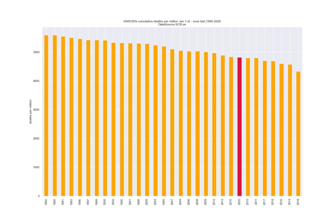
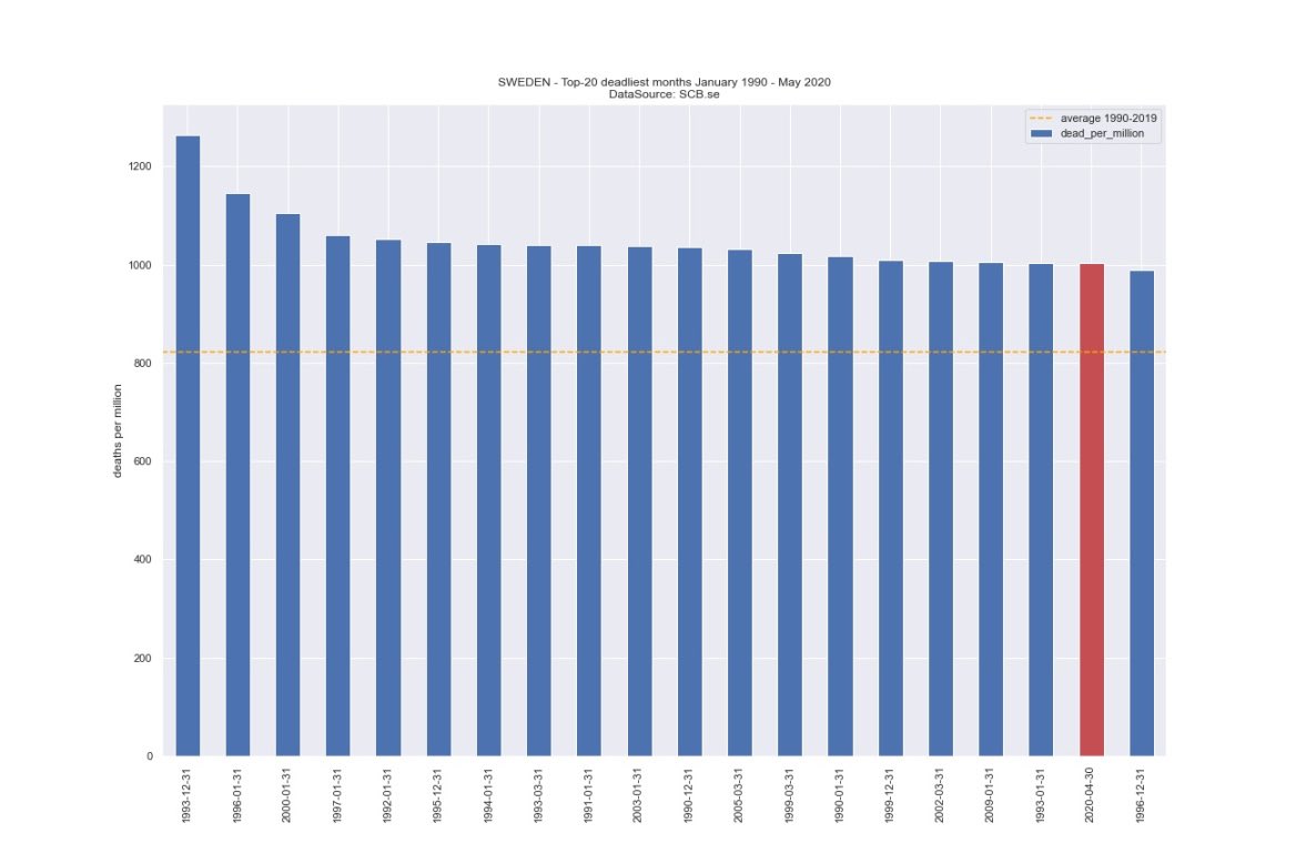
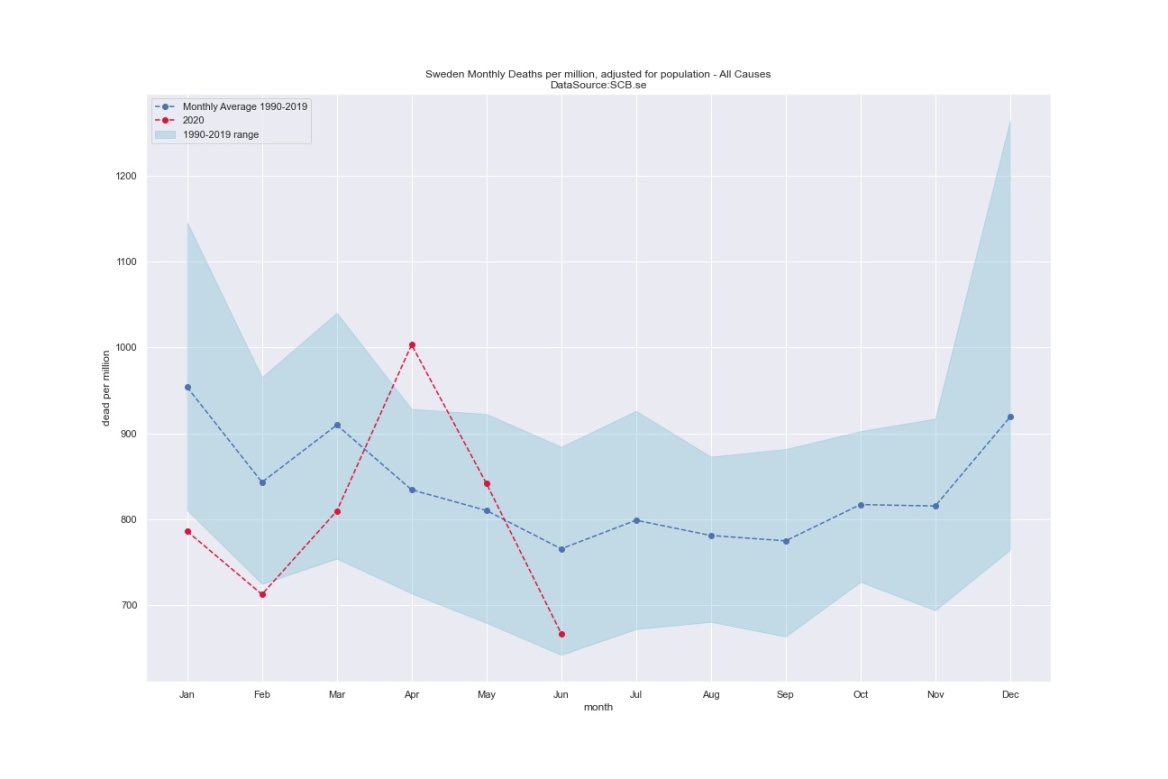
Now a blogger has done a graph using comparative figures that demonstrate that Sweden and Britain are not doing so differently - despite one country being under punitive lockdown and the other not.
Then, this says a lot.


No comments:
Post a Comment
Note: only a member of this blog may post a comment.